Running social mobile tools through the global branding machine might not seem like an obvious thing to do, but done right it can lead to some surprising – and unexpected – results. This is our story.
 “Branding was the last thing on our minds. It was October 2007 and we were knee-deep building out the alpha version of the revamped FrontlineSMS. I’d just taken a phone call from Wieden+Kennedy (W+K), a global branding giant with the likes of Nokia, Nike and Google on their books. Renny Gleeson – W+K’s Creative Director – had stumbled into what we were doing via our Social Mobile Group and wanted to see if they could get involved. I’ll never forget the first five words he said to me (they sadly can’t be repeated here).
We were still evaluating tenders from a range of web design companies in the Bay Area, but Renny was insistent that the job of building the FrontlineSMS website and brand had their name written all over it. It turns out he was right.
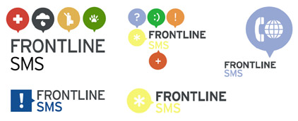
I never expected in my wildest dreams to end up working with some of the most talented brand experts in their field. If we’d gone our own route then our logo would likely have ended up as a picture of a mobile phone with the words “FrontlineSMS” underneath (this accurately describes our first effort, although it did help as a starting point for the W+K team). Early ideas – straight off the bat – looked like this.

It was a fascinating and evolving process, and one which eventually lead to a short list of keywords which we felt best described what lay at the heart of the software. One stood out – one which not only happened to be central to the early FrontlineSMS thinking, but one which came through strongly time after time in email messages from the growing community of users. And that word?
Empowerment.
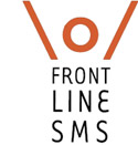
 Empowerment is hugely personal and emotive. It’s also something often expressed physically, and how to graphically represent this ‘physical expression of empowerment’ became a key theme as the logo continued to evolve. The neat concept of a ‘textable logo’ was also beginning to emerge, something which was to later prove something of a masterstroke.
According to Kelly Wright, a member of the W+K team:
We collectively focused in on the ‘textable logo’ concept because it spoke to the FrontlineSMS technology, and being purely visual, could be language independent. The challenge then became how to convey ’empowerment’ through this pared down form
The ‘\o/’ form had history, as Renny learned when he first shot the concept through to me on Skype. Check it out for yourself – it’s a Skype emoticon shortcut, and when we saw what it generated, we were both sold on the unexpected – but hilarious – additional layer of meaning.
Renny had this to say about the overall design experience:
Ken built FrontlineSMS out of love, faith in human potential, and an inspired application of mobile technology. And you can feel it when you talk and work with him. At W+K, while we have the privilege to work day in and day out on some pretty impressive brands, the chance to help craft the visual language and web experience for Ken’s creation was uplifting. From our first conversation with Ken, W+K has felt like a part of the extended FrontlineSMS family
And talking of family, something else very interesting has been happening. Something quite unexpected.
![]()
Today, as the FrontlineSMS software finds its way into more and more pairs of hands – currently 2,452 and counting – users have started sending in pictures of themselves, their teams and their community members replicating the FrontlineSMS logo, just like the ones above. I’m not quite sure what this means, but perhaps it’s yet another sign that we’ve been able to take engagement and ownership to an entirely new level.
A few of the earlier (staged) photos are available on Flickr, including this one by Erik Hersman, below, which has become something of a “poster shot” for the icons phenomenon.

Branding social mobile tools is a relatively new concept – there is no manual, after all. Many people are still learning on their feet – us included – and what has happened here is just one of the many reasons why we, and others, are finding this space so exciting to work in.”


RT @rgleeson Frontline SMS logo – developing an icon – http://tinyurl.com/klf3u9
A very inspiring design history: the making of an SMS icon http://tinyurl.com/klf3u9
There seems to be some competition for the same logo
http://upload.wikimedia.org/wikipedia/commons/thumb/f/f5/Burning-Man.svg/387px-Burning-Man.svg.png
@Charlie – Oh, yeah. Very neat! A little ‘slicker’ than ours, but not textable, I wouldn’t think (but certainly combustable) 🙂
Thank you for sharing/writing this. It is kind of a breakthrough.
I am convinced that the FrontlineSMS logo is the best damn logo ever. In many ways. http://bit.ly/965lG
RT @mlascarides: I am convinced that the FrontlineSMS logo is the best damn logo ever. http://bit.ly/965lG (rockers salute @sze)